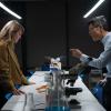
 The Gallery has been updated with some additional HQ CC season 6 (yes, six) promo photos.
It’s interesting to note the difference between the first of the group shots and the other two. The first appears to be a version of the original photograph, whereas the others have been altered. Note the more dramatic background and the tidying up of Kathryn’s coat sleeve. More worrying is the re-shaping of Thom Barry’s head!






Great Pics! Kathryn looks fantastic as always!
You’re right, RichE. Thom’s head is very weird. Did they do that on purpose or was it a mistake, you think? It looks like a mistake to me.
It is odd. They have done various bits of tidying up, including straightening John and Nick’s trouser legs and some under the chin lightening. Thom’s head shrinking and re-shaping must be deliberate.
Already made several beautiful banners from these pictures, they are up at Look again. I love the one with Lilly behind all those murder scenes
Thank you very much for these HQ pix, I’ve been looking for them for a long time!
I had never seen the one with the “murder wall”, it’s weird, I can’t seem to find anything related to Cold Case hang on it!
Would you happen to also have the individual shots for the rest of the squad? If you could you email them to me, it would be great.
Take care
Wall? Oh yes, there is something behind Kathryn! Why had I not noticed that before?
The contents of the wall does look un-Cold Case related. Perhaps it was put together by someone outside of the production crew.
I will look into getting the other photos for you.